Does Your Brand Color Impact Consumer Behavior?
And the winner is…
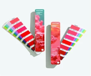
“Very Peri.” In keeping with award season, PANTONE®, better known as the Color Institute, recently announced their pick for Color of the Year, 2022. Each year, Pantone’s color experts search the globe for new color influences and trends. But why does color matter so much that it deserves its own yearly designation? Color, they say, is the most powerful and influential part of a design, and significantly impacts a company’s brand. According to Leatrice Eisemen, the Executive Director of the Pantone Color Institute, “Color is an equalizing lens through which we experience our natural and digital realities and this is particularly true for Living Coral. With consumers craving human interaction and social connection, the humanizing and heartening qualities displayed by the convivial PANTONE Living Coral hit a responsive chord.”

Picture provided by PANTONE®
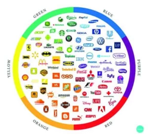
Some of the most recognizable brands rely on color. In fact, out of all of the visual components a brand or logo may have, including, shapes, symbols and words, color is the one that people remember most. Colorcom.com reports it only takes 90 seconds for someone to judge your brand and 85-90 percent of that assessment is influenced by its color. There are many studies about what color represents to people and how it affects purchasing decisions. Canva created a graphic to help emphasize how these well-known brands use color in their logos.

How can color improve your brand message specifically? Allegra Marketing explains:
- Brand personality: Every business wants people to see its strongest qualities. Making sure your core business values show through goes a long way towards being a brand that people feel automatically attracted to. Your choice of brand colors tells customers whether your business is primarily artistic, high-tech, trustworthy, friendly, playful or serious.
- Brand recognition: Besides communicating your company’s message, branded color palettes make it easier for people to remember you. Seeing certain colors together instantly evokes your brand and makes people associate it with positive experiences.
- Effective marketing: Great marketing isn’t just about presenting customers with a long list of benefits and statistics showing why your products are better. To motivate them to buy from you, it’s essential to stimulate emotions as well. If you can get people to imagine themselves using your product and feeling happier, purchasing intent follows automatically.
In terms of color for an entire product, in particular to the appliance industry, 66 percent of consumers will not buy certain appliances unless it comes in their preferred color. They also want to ensure a color “fits” before they buy it because appliances, including gadgets and small counter top appliances, last longer than other products. As an appliance designer, how do you know what color will sell?
Connecting with Color
A recent article published by Appliance Design, called, “Connecting with Color—How Consumer Choices Shape Trends in the Appliance Industry” tells us, “Color trends reflect the tastes, moods and desires of the broader society. By taking cues either from popular social media channels or the latest gadgets, the ability to anticipate color preferences—and the capacity to sync those insights with consumer demand—plays an influential role in the success of companies and products around the world, including those in the appliance industry.”
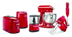
KitchenAid announced the launch of their “New Limited Edition Queen of Hearts Collection” in celebration of their 100 year anniversary. The 100 Year Limited Edition features countertop appliances in a new “Passion Red” color, which is said to help fuel confidence and power in the kitchen. Their website also displays a timeline of the changes that were made to their logo over the last 100 years. What do you think of Passion Red?

Picture Provided by KitchenAid
Deciding on a color
Deciding on a color for a logo or product can be a tough task for designers when you need to keep up with all of the latest trends and color studies, but finding the right printing partner to help create your badges or graphic overlays does not need to be. Once you find the right color, you can trust DuraTech Industries to get it right. We offer a range of colors-both standard and custom to meet your needs.
We utilize the most up-to-date color matching and color control equipment. For example, a spectrophotometer is used to aid in the formulating and color checking of day-lit colors, while a separate piece of equipment, a spectrascan, is used to read backlit colors. This equipment assures that the color approved will be consistent, not only throughout a production run, but from run to run, and across your entire line of parts (on identical materials and finishes).
It is important to note that the material and finish will have an effect on the color. A color originally printed first surface on a paper substrate can look quite different when printed second surface on velvet lexan. In fact, because it is quite subjective and dependent on a number of viewing variables, an exact color match on different substrates may not always be practical. Although this can make color matching difficult and time consuming, DuraTech will submit colors for approval to the customer.
What about other colors?
For any colors other than black or white, a chip or specific call out (Pantone Matching System, or PMS, Federal Standard, ANSI, etc.) must be given before we can proceed. Standard colors will be used for black and white unless otherwise indicated. Standards may be used for other colors as well and should be considered whenever possible. Where the difference in colors may be less noticeable, the added expense to achieve a custom color could be avoided. A custom color requires original formulation time, line color checking to ensure the color remains consistent throughout the run. Standard color chips are available upon request.
Our spectrophotometer will make color control easier and more accurate, but our lab contains many devices to assist us with color matching and color control, including:
- Digital Viscometer: We use this to automatically measure the viscosity of ink. For example, a thick liquid that does not flow easily has high-viscosity; a thin liquid that readily flows has low-viscosity. The viscosity of ink strongly affects color strength, graphic quality, ink thickness, density, ink usage, press speed and drying time. Without measuring viscosity, branding images and messaging may not print correctly, possibly leading to low quality and rejected print runs.
- Digital Scales: Digital scales help us monitor the usage, or consumption of inks.
- Hand-held Portable Spectrophotometer: Unlike the table top Spectrophotometer, the hand-held is a mobile. It allows us to bring the Spectrophotometer right to the sample and test on a variety of surfaces to achieve consistent and accurate color.
- Xrite 4 spectro densitomter: This measures ink density on a color and provides feedback to our technicians as to how to adjust ink levels should density readings be too high or low.
- Digital glossmeters (20, 60, 85 degrees): Glossmeters measure the gloss reflection on the surface of a material. The gloss of the material can be measured from different geometrical angles, i.e. 20, 60, and 85 degrees.
- Digital densitometers: Densitometers measure the degree of darkness (optical density) of a photographic or semitransparent material or of a reflecting surface. It doesn’t measure color but measures density.
- MacBeth Observation Booth: Colors appear differently under different lighting conditions. The use of a light booth to simulate different lighting conditions helps us obtain objective color assessments. Our booth allows us to view samples in four different types of light sources.
- Spectroradiometers: This is a device for reading transmitted color. It directly measures the short, medium, and long wavelengths we see as color. Spectroradiometers can differentiate between different spectrums of light that all appear the same color, for example different varieties of white light.
DuraTech’s ink experts
Our ink technicians have a thorough knowledge of our processes and are trained in problem solving techniques. They are tested twice yearly for color acuity. The ink manufacturers we work with are also required to supply a certificate of compliance with every ink order.
It’s important to be aware of your color’s voice and the impact it has on your brand. Let us help you tell your story through color. Do you think you have a tough color to match? We would love the challenge!